
Asclepius
Idea 12-
Blurb-
In a world where a very small chunk of the population has special abilities or mutations, a highly powered organisation is ‘training’ children to become the perfect heroes so as to protect the world, but one person sees past their façade and tries to break free.


The name ‘Asclepius’ came from two different things. The first being a flower, more commonly known as ‘Milkweed’ named for their latex, a milky substance that is let out when cells are damaged. The other being a hero and god of medicine in Ancient Greek religion and mythology. The plants genus is also named after the Greek god.
The first idea that’s coming out from a series of ideas. The original idea for this media product was the leap of faith scene from the first animated spiderman movie ‘Spiderman: Into the Spiderverse’.

This is the current storyboard for the animation/movie trailer although, it has been changed a couple times since the original, with panels being added and removed as well as small changes and extra pieces being added along the way.
First of all, I created a drawing reference to use as a base for the end outcome. Then I went over that in a digital format, adding in extra details and moving or changing things if need be. After that I went over the design again but this time both using colour and detailing a few more things. Finally, I coloured in the base and added any finishing touches, like the background and my signature.
This is the process I used when creating the final picture.


This tarot card is known as ‘The Fool’. It tends to represent foolishness, carelessness and naivety. Although it can also represent free spirit, purity and new beginnings. I believe that all of these show the protagonist rather well. This is also not the original ‘Fool’ tarot card, but I felt as though this one fit both the character and the story better as it is a more modern take on the traditional card.
The Fool Meaning - Major Arcana Tarot Card Meanings
The Fool Meaning ✦ ✦ ✦
Upright: innocence, new beginnings, free spirit.
Reversed: recklessness, taken advantage of, inconsideration

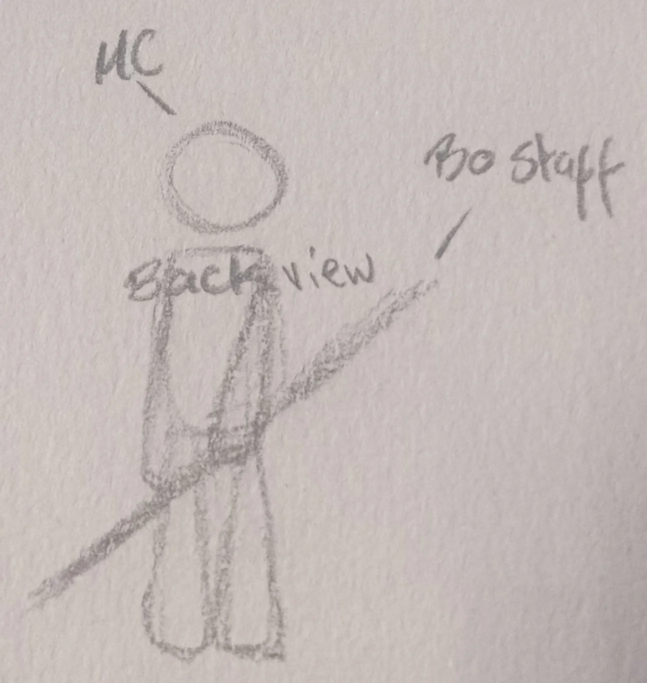
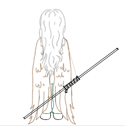
The weapon I believe the protagonist of this story to best wield would be a Bo Staff. I believe that the protagonist would have chosen this as her weapon of choice because although she has to fight, as she doesn’t get a choice, she would still want something that would do the least amount of damage to her opponent. Bō are typically around 1.8 m long and used in Okinawan, Martial arts while being adopted into Japanese arts such particular bojutsu. The bō is usually made with unfinished (no varnish, stain, etc) hard wood or a flexible wood, such as red or white oak, although bamboo and pine wood have been used; more common still is rattan wood for its flexibility. The modern bō may be tapered in that it can be thicker in the centre than at the ends and is usually round or circular. Some bō are very light, with metallic sides, stripes and a grip.
There is much more that you can learn about this interesting weapon, so I’ve left a website at the bottom so you can learn more about them and their history if you want to.

A character profile I created for the protagonist.
An Interview with the protagonist-
-Why do you think you work so much? I think I work so much because of how much I love doing my job. I find so much joy in becoming a new character and submerging myself in their world. -What, beyond talent, do you feel one needs to book work and keep working? Probably the resilience and patience to work hard and continue to do so even if things do end up going awry . -What in your life experience was most helpful to you in becoming a voice actor? I believe the most helpful thing would probably be all the acting, singing and a bit of dancing I did while growing up, and then having a lot of supportive people around me. -Any books or programs you recommend? Well obviously this movie/book, cause it’s gonna be great trust me, and any other that the author comes out with, but also things like the Percy Jackson series and others also from that author. For programs I’d probably recommend Jujutsu Kaisen and Demon Slayer because they are incredible pieces of animation.


Get ready to embark on a whimsical journey through fantastical realms. This isn't just another movie – it's an immersive experience into a world like no other. Discover the hidden secrets, unravel captivating mysteries, and let your imagination run wild.
Leave behind your doubts and inhibitions, and let us transport you to a place where dreams come alive. We've poured our heart and soul into creating a movie that will leave you awe-struck and craving for more. Join us on this cinematic adventure and let yourself be whisked away to a world of enchantment.

My Portfolio
Artwork-

This first picture is a painting of an idea I’ve had for quite a while. As my art style has changed so has the design of the idea but eventually it became this. Originally the person was supposed to look more human than that but I think that overall it looks better like this and stands out better.


This was another idea that I’d had and reworked multiple times, mostly pertaining to what the path lead to, what was out the door. In the end I settled for an idea that I’d had for another drawing. It was of me and my friends sat/ doing different actions around a tree. My final painting also manages to link to my other paintings as well.


This is because, as you can see, the meadow from the other painting is in the background as well as there being my little blob people by the tree. As you can clearly see, during the process I changed my mind on one or two things, such as the path to the doorway, I ended up hating the yellow I decided on originally and ended up settling for white instead.


Originally, this painting wasn’t going to glow in the dark, but just before I began painting it I gained some glow-in-the-dark paint for Christmas and that is what helped me to create what you see now. The photograph I have of this painting doesn’t do the true glow of it justice but it looks cool none the less. Once again the image links in with the other paintings as is shown by the blob person in the centre of the image.

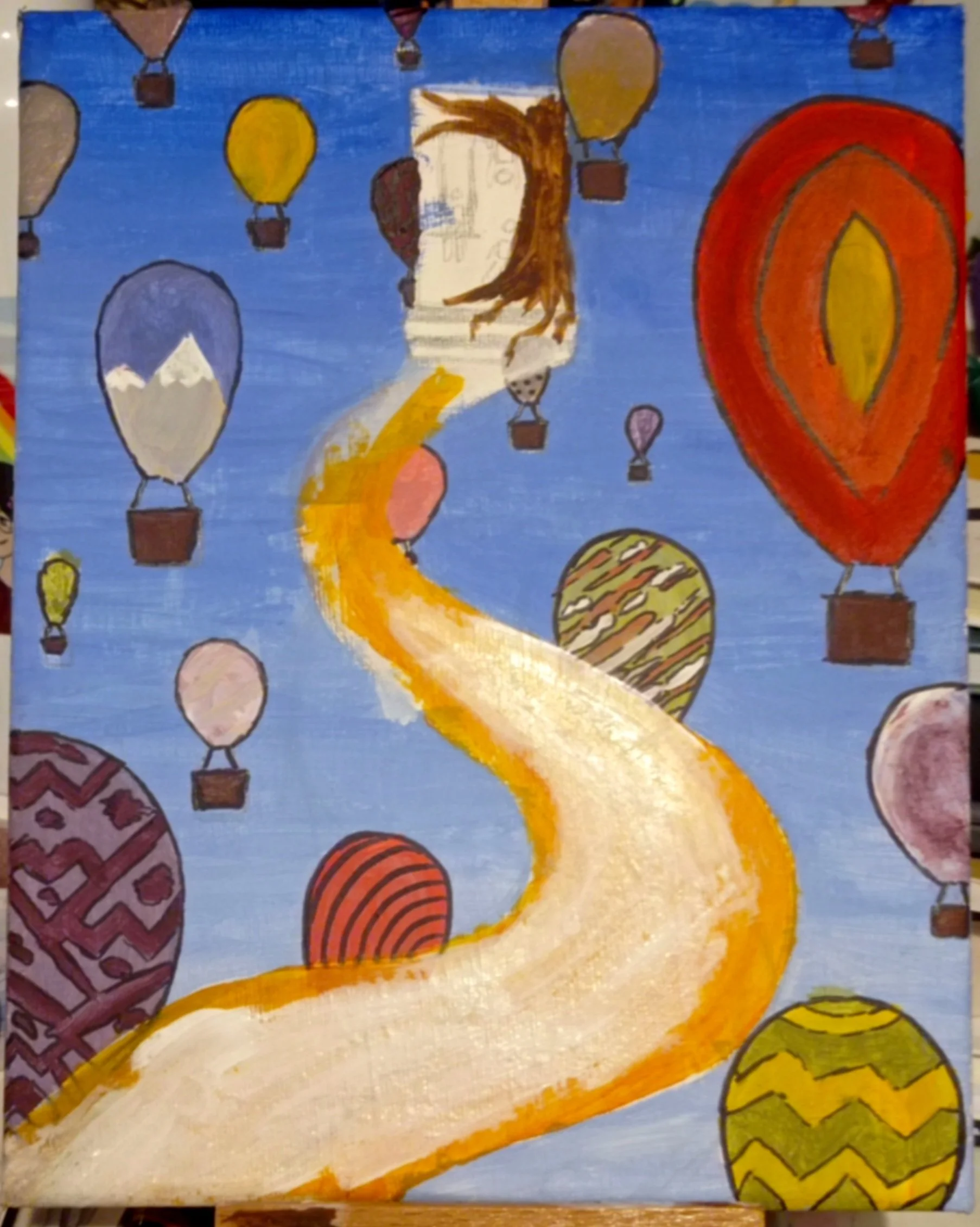
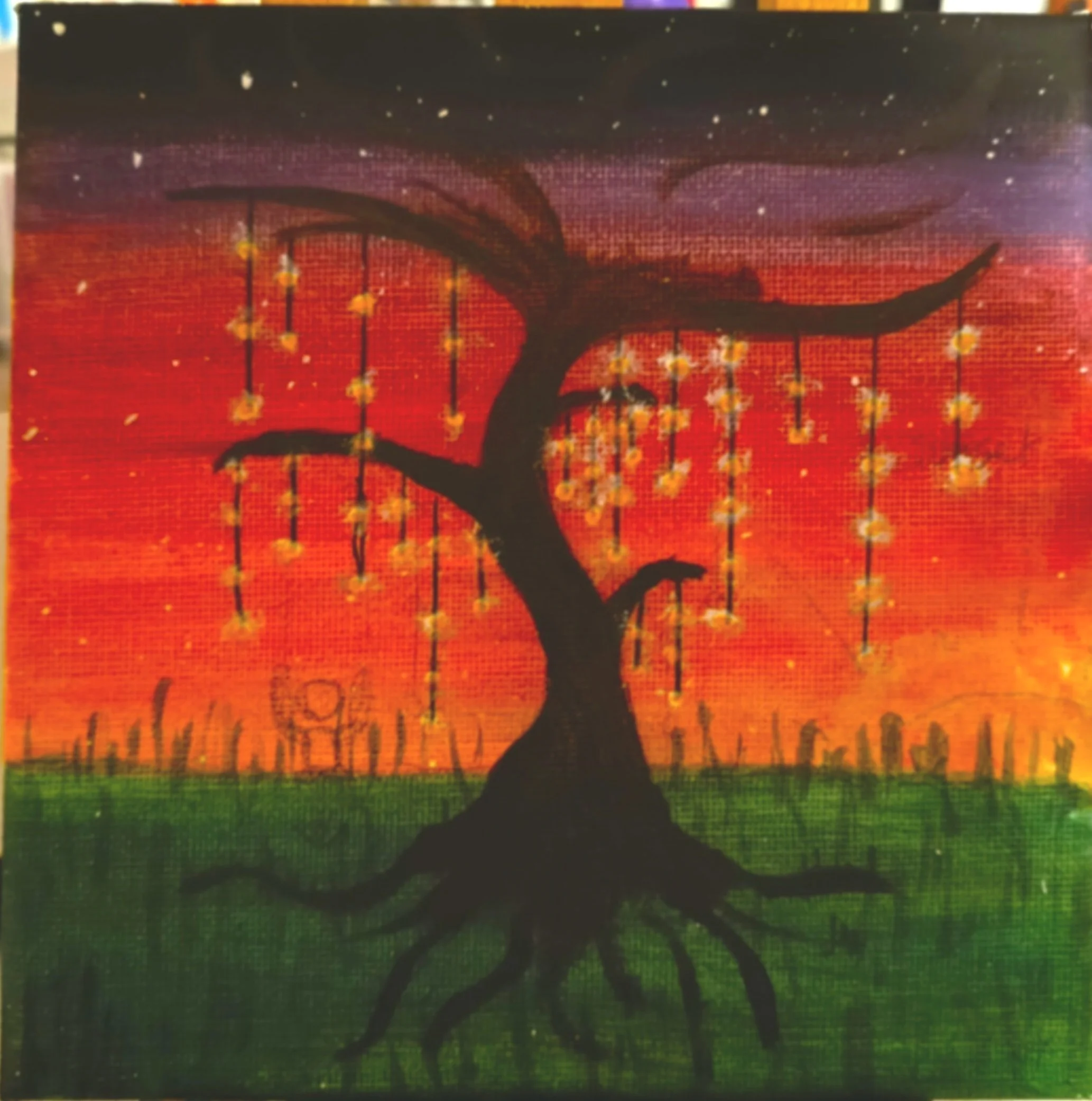
Although it seems to be a rather small image I can assure you that in real life it is a much larger canvas. This is a sketch now but I wanted to show not only what I have done but some of the things I want to do as well as a few future ideas or additions to other paintings I want to make, I believe that this is the best thing to start that on. I have many ideas for this specific piece and in the end I think it’ll be fun to complete. There are so many tiny details that would be so difficult to add on to a smaller canvas, but because this one is so big I can add in the little things, like how much time is in the timer(24hrs) and initials(namely my families initials) carved into the wood of the tree, quite easily.


These two images come from my most recent project as a gift for one of my friends birthday. The idea for it was tweaked on multiple occasions and this wasn’t the original idea, mainly because it’s rather difficult to do much of anything on a jigsaw puzzle.

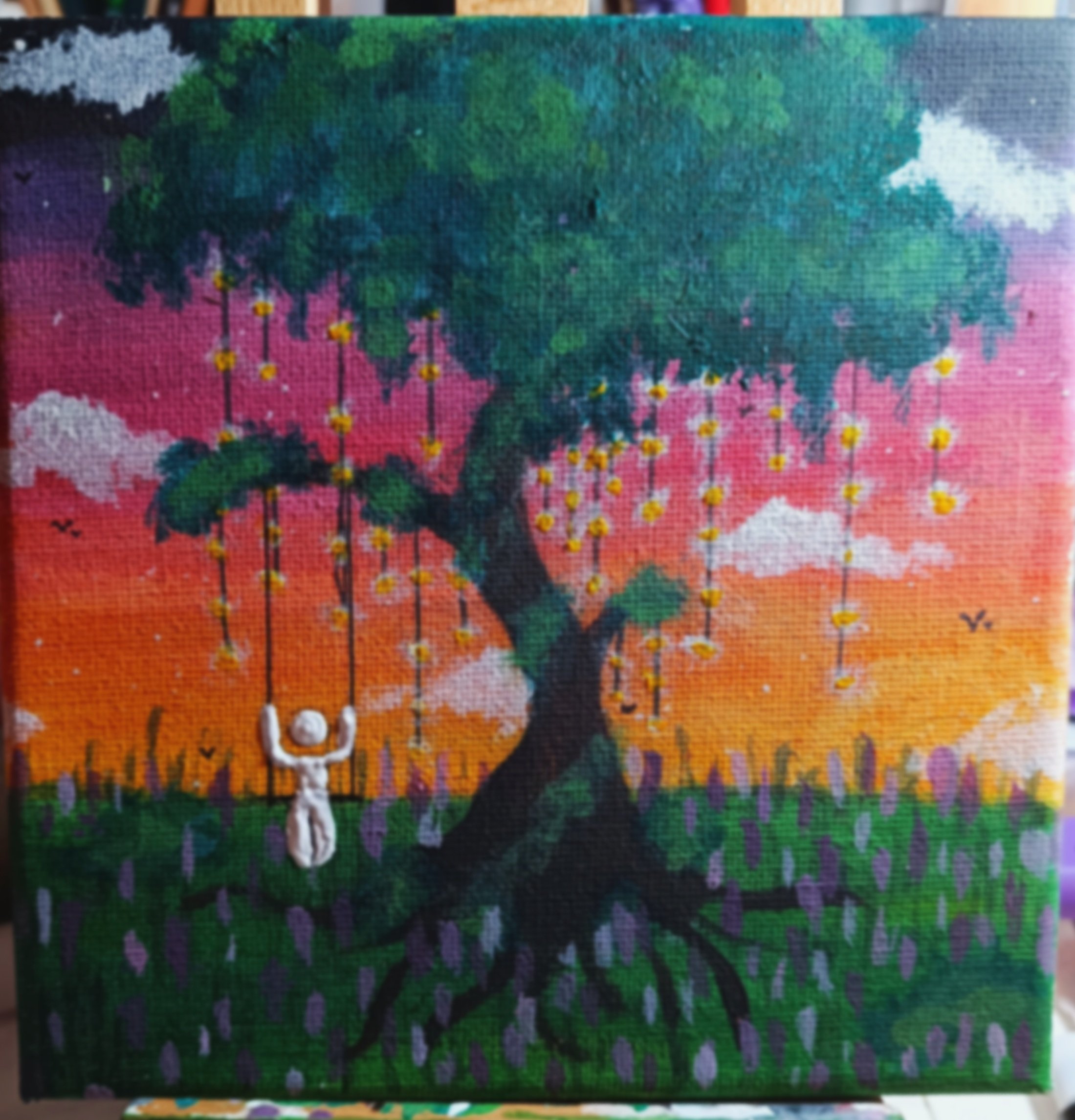


This is one of the paintings I take immense pride in as of currently, it is also one of the many I decided to give away to loved ones. A lot of the paintings I have created were made for friends and/or family and at the time I didn’t think to take photos of them, but they’re still very much my work and I take pride in that no matter what. The process of creating this painting took a few days and was an idea I came up with on the spot at starting it, you can clearly see this through the process of painting it and the different lighting in the pictures, I have done my best to slightly edit them and get them as similar in terms of colouration and lighting as I possibly could but it is rather difficult to do considering the difference in times of day and light levels as well as different kinds of lighting used within my space during this time. This idea was fully made up and I just ran with it, adding on anything I believed would make it look better. For example, the addition of the slight white around the lights to make them pop and truly seem as if they’re glowing was a split second decision I had only done in simple drawings before that I ended up liking. In many of my paintings i’m truly happy with the way my clouds come out, sometimes as if ripped of the sky itself (in my opinion anyways), but in this painting especially I love the way they pop off of the picture. Also, similar to my other pieces, this one is linked in with my other paintings. This time however it is very specifically linked by the little blob person as the tree is not the same as in my other paintings and I had yet to use the idea of a lavender field in my works. This lavender field however I think was the best option for this painting rather than any other kind of flower as it both contrasts against and works beautifully with the coloured sky while the sun falls from it to the side.


The image of the left is one of my first pieces of digital art and one i’m still rather proud of to this day. The picture on the right however, is the most recent iteration of this image, there have been many different versions of this girl in the past but to look at what she was and what she is now I am proud of the progress I have made. It may not even look like much but from this alone I can clearly tell how far I have come from my beginnings to where I am now. This shift may be better shown by different before and after pictures but I believe it’s summed up nicely by this alone.
Photography-


I am not someone who really enjoys portrait photography, I much prefer nature photography. However, these are some of the few photos of people I’ve taken that I truly like. Both images are of my younger sister acting as my model and were originally taken for a competition the Matrix was holding between schools. Many of my photos when taken have meanings, especially when done like these. To prove my point, the picture on the right is mean to represent imbalance. My original idea for this piece was to base it off of the scales used in Egyptian mythology, the weighing of the heart against a feather. However, rather than using a heart and feather, I used a glass bottle and a paper flower. My topic/brief in my photography lessons at the time was ‘recycle and represent’ therefore leading me to use this idea in my work. The image shows the imbalance between nature and waste in our world and how it’s affecting it. The Egyptian scales show someone’s heart to be heavier than a feather when they’ve been an evil person, this is shown in the glass bottle, telling you that the waste is a bad thing in the eyes of the scale. On the other hand though, the flower represents the good that is shown when the feather is heavier than the heart, it could even be viewed as the feather itself if that is how you wanted to interpret it. As the saying goes, art is in the eye of the beholder.

This is another one of my few portrait photographs, again of my younger sister. This one, to my remembrance, doesn’t have a meaning but the photo was taken after a massive family party. All images from that day, even this one, are, at least, slightly blurred. Although this blur reminds me of the fever dream that party was, in a good way, and therefore holds great significance to me.
This is an edit I created for one of my photography classes. It was based off of the creature known as a ‘Mimic’, something that embodies the idea that everything is not always as it seems.


One of my closest friends helped me with this one. The original idea came from elsewhere though unfortunately, where I cannot remember. The editing of it was made up as I went along, but it originally was made up of two pictures. The first, of my friend holding one of two umbrellas, closed, in front of a projector. The reason for this was that there was no other concentrated light source that would work for my idea, this unfortunately resulted in the image becoming green. The second of the two images was of them, still stood in front of the projector, in the same position but, contrastingly, with my second umbrella opened (by me though, I didn’t want them to gain whatever, if any, bad luck came with opening an umbrella indoors). These two images were then layered over one another and I drew raindrops on the ‘screen’ the projector was projecting on to by “burning” little raindrop shapes on to it (as the editing site ‘pixlr’ called it). After that I decided there needed to be a reason for these raindrops, therefore, I added teardrops to the other side of the image. The rain on the side of the closed umbrella symbolises the tears from the side of the open umbrella, they are always caught in the rain one way or another.

Trapped. That is what I ended up deciding this photo would be called. Stuck in a glass bottle, as if trapped inside your own brain. The symbolism in this photo goes rather deep in my opinion but once again art is in the eye of the beholder and I cannot tell you what to think of this as.